
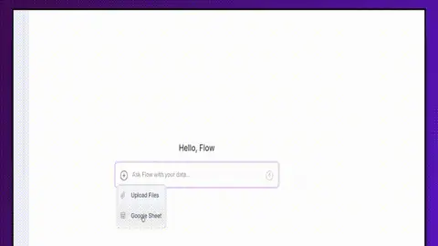
The 15-minute exercise is now 15 seconds
We designed it to be the ultimate crash course in core data analytics concepts: cleaning, transforming, joining, aggregating, visualizing, and automating.
Columns AI Blog1 min read
16 stories
We designed it to be the ultimate crash course in core data analytics concepts: cleaning, transforming, joining, aggregating, visualizing, and automating.
It comes in messy, unformatted, and often fragmented pieces. The ultimate goal of any data process is to bridge this gap: to make raw data analyzable so we can extract meaningful insights, which are most effectively understood when visualized.
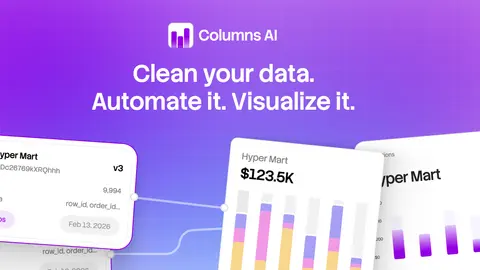
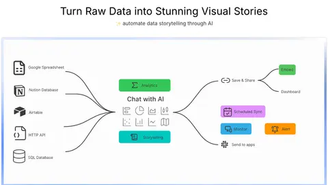
The new Columns is a comprehensive platform to automate all your data work
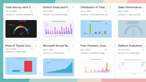
Mastering data visualization by learning common charts and their variants
Columns AI has been recognized by Research.com as a top business software solution, highlighting its impact in data storytelling and visualization.

The rain has been pouring here for a few days, for Seattle, it means the beginning of the fall. I love Fall, it's the season of colors. In the morning, I feel so content walking with my daughter, on the soft yellow leaves toward the school, before the bell.
Airtable is used by many people, and we are excited to announce that Columns now supports Airtable connection. Just simply connect your Airtable, and choose any table to be analyzed and visualized in Columns.
As we are planning Columns 2.0, we have fully embraced AI to help you tell a better story with your data. We are excited to share with you the first demo where Columns acts as a storyteller.

You may have tried Columns Notion integration Notion Integration to analyze and visualize your Notion database, but do you know what the full loop with Notion is?
April has been great so far for Columns and our users, people find it more and more enjoyable at data storytelling, from insights discovery, and chart building, to presentation beautification.
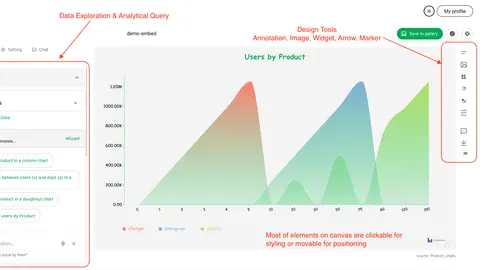
As a blog writer, do you dream about embedding a live data graph in your article? It shines your content to be more attractive and makes it much more digestible for your readers, also it makes it more worthwhile for your readers to share with others.
Columns is a data storytelling platform, we have continued building storytelling technology for you to do better communication using your data. It is designed to meet these goals, if any of these fails for you, we owe more work to you:
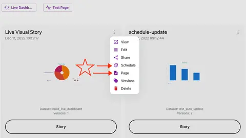
Today we only present a single update - but BIG!! 🚀🚀🚀🚀🚀 Scheduler Set a schedule to ask Columns auto-update your data story!
Add new graph type: Word Cloud It comes with a wizard where you can choose a single key column to render a word cloud. You can customize its palette to use different color to display text. General font settings impacts the word in display unless overwrite by settings.
Added a few useful chart types. Tree map - useful for . (found in Tree chart settings) Radar. Boxplot, Dot plot in addition to scatter plot. These are useful for statistics. Big Text: when there is only one number in your query result.
Completely new visual story workspace Work with multiple different data sources in one visual story. Save mulitple versions in one edit. Brand new data source exploration, get all information about the data you're working on.
Showing 16 of 16 stories
You're all caught up.
Get the top AI news and tools straight to your inbox every week.
Weekly · AI news
Join 15,000+ AI enthusiasts